Introduction
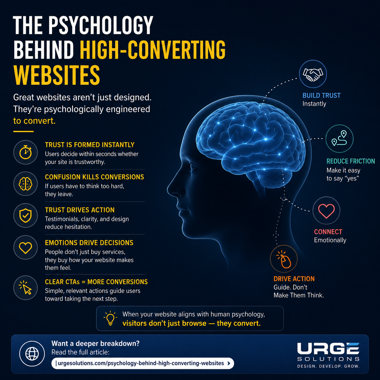
A website is not just a digital brochure anymore—it’s a decision-making machine.
The difference between a website that gets visitors and a website that gets sales is simple:
👉 Psychology.
High-converting websites are built around how humans think, feel, and decide—not just how they look.
In this article, we’ll break down the psychology behind high-converting websites in a simple, practical way.
1. First Impressions Decide Everything (The 3-Second Rule)
Users decide in 3 seconds or less whether they trust your website.
If your site looks outdated, slow, or confusing, visitors leave immediately.
Psychological trigger:
- Humans judge credibility visually first
- Clean design = trust
- Clutter = doubt
👉 This is why modern websites focus on simplicity, spacing, and clarity.
2. People Don’t Read, They Scan
Most users don’t read websites—they scan them like headlines.
What this means for conversions:
- Use clear headings
- Highlight benefits
- Keep paragraphs short
- Use bullet points
Psychological reason:
The brain prefers low effort processing. If something is hard to read, users skip it.
3. Trust Is the Real Currency Online
Before buying anything, users ask one question:
👉 “Can I trust this business?”
Trust signals that increase conversions:
- Testimonials
- Case studies
- Client logos
- Real photos (not stock images)
- Clear contact information
Psychology behind it:
People follow social proof—if others trust you, they will too.
4. Emotion Drives Decisions (Not Logic)
Even in B2B websites, decisions are emotional first.
Then people justify them logically.
Example:
- “This service will save me time” = emotional relief
- “This service increases ROI by 40%” = logical support
What works best:
- Pain points (problem awareness)
- Outcome-driven messaging
- Transformation storytelling
5. Simplicity Wins Over Complexity
Too many options confuse users.
This is called the Paradox of Choice.
High-converting websites:
- Have one clear CTA (Call to Action)
- Guide users step-by-step
- Avoid unnecessary distractions
👉 Example: “Get a Free Quote” works better than 5 different buttons.
6. Color and Design Influence Behavior
Colors affect how users feel:
- Blue = trust & stability
- Green = growth & success
- Red = urgency & action
But more important than color is contrast and clarity.
If users can’t see your CTA clearly, they won’t click it.
7. Speed = Money
A slow website kills conversions instantly.
Psychology behind it:
Humans associate:
- Slow website = unprofessional business
- Fast website = reliable business
Even a 1-second delay can reduce conversions significantly.
8. Clear Value Proposition Converts Visitors into Customers
Within seconds, users should understand:
👉 What you do
👉 Who you help
👉 Why you are different
If this is unclear, they leave
Conclusion
High-converting websites are not built by chance—they are built using human psychology principles.
When you understand how people think, feel, and decide online, you can turn your website into a powerful sales machine.
If your website is not converting, the problem is not traffic—it’s psychology and structure.
Most websites lose customers because they lack trust, structure, and conversion strategy.
👉 Want us to analyze your website for free?
Get a Free Website Conversion Audit
I learned something new from this post💙
This is a useful resource for new people.
nice keep going
The explanation is simple and easy to understand.
I enjoyed reading this article.
agree